
Context
After 3 years online, our website felt outdated. The initial design was too minimal and focused on a very young audience. To drive more subscriptions, we needed to broaden our appeal and communicate our value proposition more clearly.
The approach
We started with an internal workshop involving ~40 colleagues, gathering perspectives on how to reorganise navigation and highlight what truly mattered. We also analysed user behaviour through heat maps, uncovering pain points, search patterns, and expectations. These combined insights led to a restructured information architecture and smoother user flows, ensuring our USP and value proposition were easy to find and understand.
Key outcomes
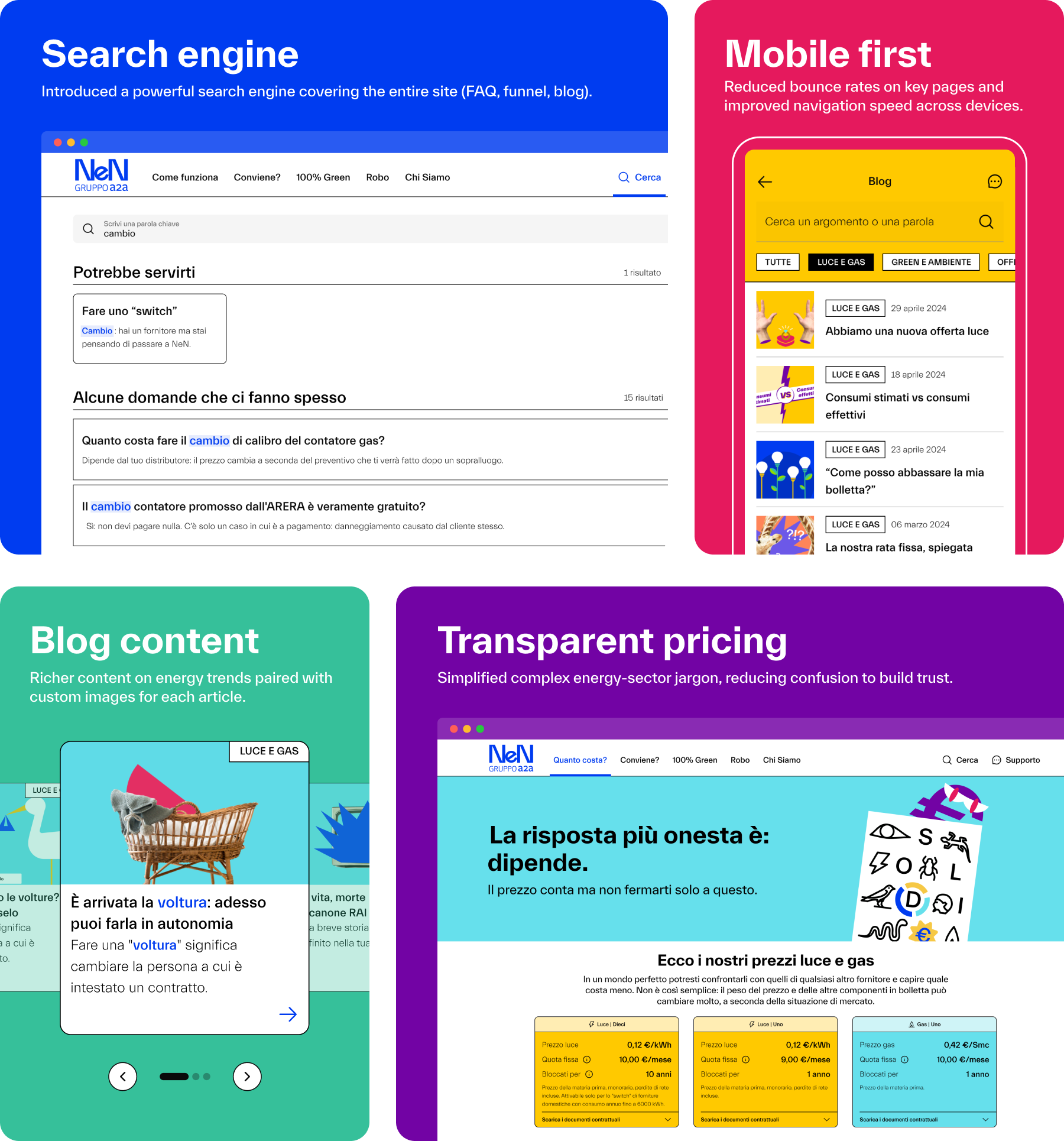
– Improved usability, navigation speed, and conversion rates across devices.
– A fully redesigned homepage with clearer storytelling and better-organised content.
– Powerful search engine covering the entire site (FAQ, funnel, blog).
– Transparent, jargon-free pricing explanations.
– Mobile-first responsive design.
– Refreshed brand elements that reinforced NeN’s playful yet trustworthy identity.
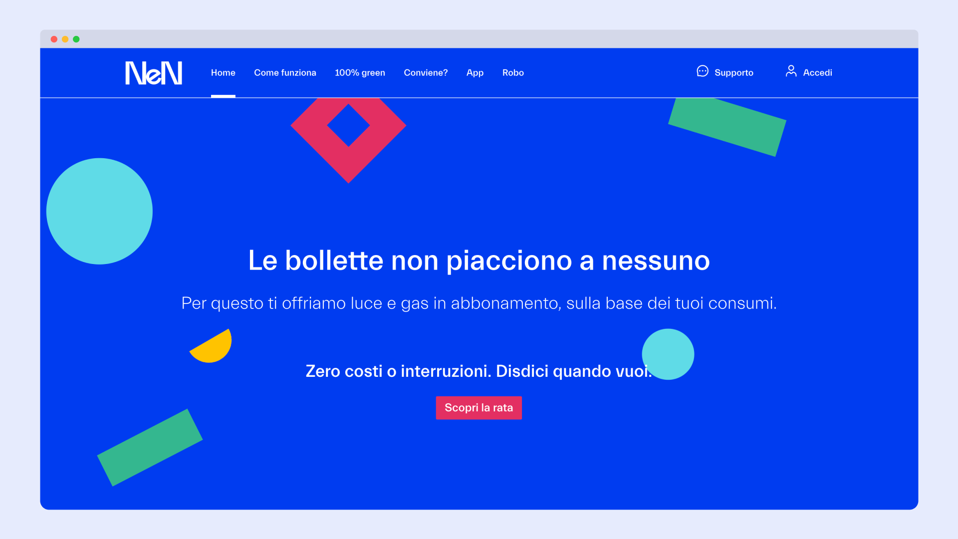
Before
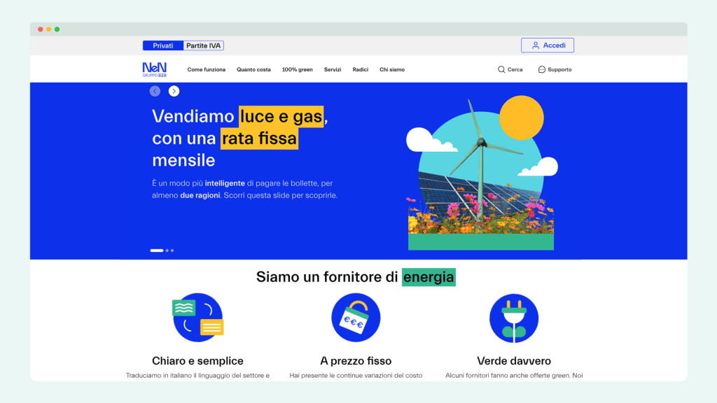
After
Results
We measured success using the System Usability Scale (SUS), achieving a score of 88,25/100 (above the “excellent” threshold of 85,5). Beyond aesthetics, the new site delivered measurable improvements:
- Higher conversion rates in all website pages.
- Reduced bounce rates on key product pages.
- Increased time-on-site thanks to streamlined navigation.
- Stronger brand perception, with users describing the experience as “fresh, simple, and fun.”
